VUCAR

VUCAR

I designed a set of website pages for a Vietnamese used cars marketplace for both buyers and sellers.

I designed a set of website pages for a Vietnamese used cars marketplace for both buyers and sellers.

MAY - SEP 2023

MAY - SEP 2023

WEB DESIGN

WEB DESIGN

VUCAR.VN

VUCAR.VN

Project overview

Project overview

VUCAR is one of the market leaders in used car marketplace based in Vietnam. They have innovative features to facilitate used cars buying & selling process with various benefits for both side. While the functionality of the platform does its job, the website lacks visual outstandingness and easy-to-navigate layout & flows. I came in to design certain pages & modules of the platform, focused on giving the website a new fresh look and clean layouts to help customers achieve what they want on the platform easier.

VUCAR is one of the market leaders in used car marketplace based in Vietnam. They have innovative features to facilitate used cars buying & selling process with various benefits for both side. While the functionality of the platform does its job, the website lacks visual outstandingness and easy-to-navigate layout & flows. I came in to design certain pages & modules of the platform, focused on giving the website a new fresh look and clean layouts to help customers achieve what they want on the platform easier.

Design process

Design process

DEFINE

OBJECTIVES

DEFINE

OBJECTIVES

Understand the problems client is facing, their requirements and final goals of this project.

Understand the problems client is facing, their requirements and final goals of this project.

IDEATE

DESIGN DIRECTION

IDEATE

DESIGN DIRECTION

Research on layouts, user flows and visual references that fit the requirements of clients.

Research on layouts, user flows and visual references that fit the requirements of clients.

DELIVER

UI DESIGNS

DELIVER

UI DESIGNS

Deliver UI designs based on approved visual direction, both PC and mobile responsively.

Deliver UI designs based on approved visual direction, both PC and mobile responsively.

1. Define objectives

1. Define objectives

Context

Context

VUCAR platform is full of excellent functions for users, but it lacks good UX to navigate users to do the right things and lacks visual prowess to bring "wow" moments for users.

VUCAR platform is full of excellent functions for users, but it lacks good UX to navigate users to do the right things and lacks visual prowess to bring "wow" moments for users.

General requirements

General requirements

• Continuously provide quality visual & easy-to-navigate layout for different web modules.

• Continuously provide quality visual & easy-to-navigate layout for different web modules.

• Deliver 2 responsive breakpoints: PC & mobile.

• Deliver 2 responsive breakpoints: PC & mobile.

• Deliver FAST to get features live quickly.

• Deliver FAST to get features live quickly.

Common detailed requirements

Common detailed requirements

For each module, product team would provide me with a detailed PRODUCT REQUIREMENT DOCUMENT which included a set of desired features, sections, behaviours of the features, etc. and sometimes a drawn wireframe. I usually had a brief meeting with product team to clarify requirements, deadlines, scopes of work.

For each module, product team would provide me with a detailed PRODUCT REQUIREMENT DOCUMENT which included a set of desired features, sections, behaviours of the features, etc. and sometimes a drawn wireframe. I usually had a brief meeting with product team to clarify requirements, deadlines, scopes of work.

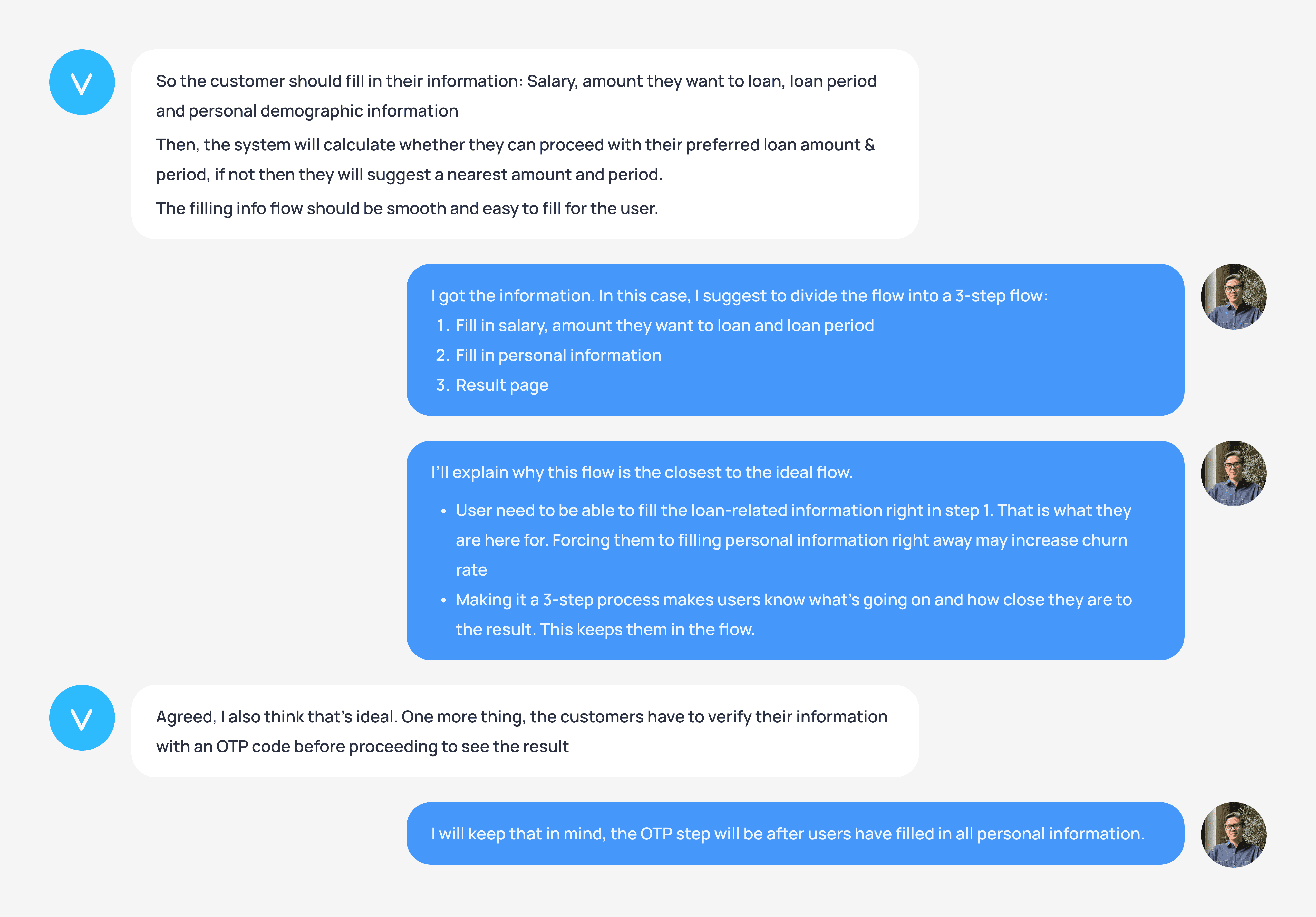
Often, I was required to leverage the modules visually and suggest user flows/layout for the module (even if there was a drawn wireframe, I would still suggest better layout if I identified a better one). Our discussion regarding requirement & suggestion usually went like this (LOAN module):
2. Ideate design direction

2. Ideate design direction

After clearly understood the brief, I would start looking for inspirations from similar features of other products, interesting layouts and user flows. I collected my references into a board and present to clients about my choices, pros and cons & gave them the power to decide. Notice that in certain modules, I skipped this step if the drawn wireframe were good to implement, the user flows were straight forward or there was nothing much to leverage visual.

After clearly understood the brief, I would start looking for inspirations from similar features of other products, interesting layouts and user flows. I collected my references into a board and present to clients about my choices, pros and cons & gave them the power to decide. Notice that in certain modules, I skipped this step if the drawn wireframe were good to implement, the user flows were straight forward or there was nothing much to leverage visual.

A board usually look like this (ABOUT US module):
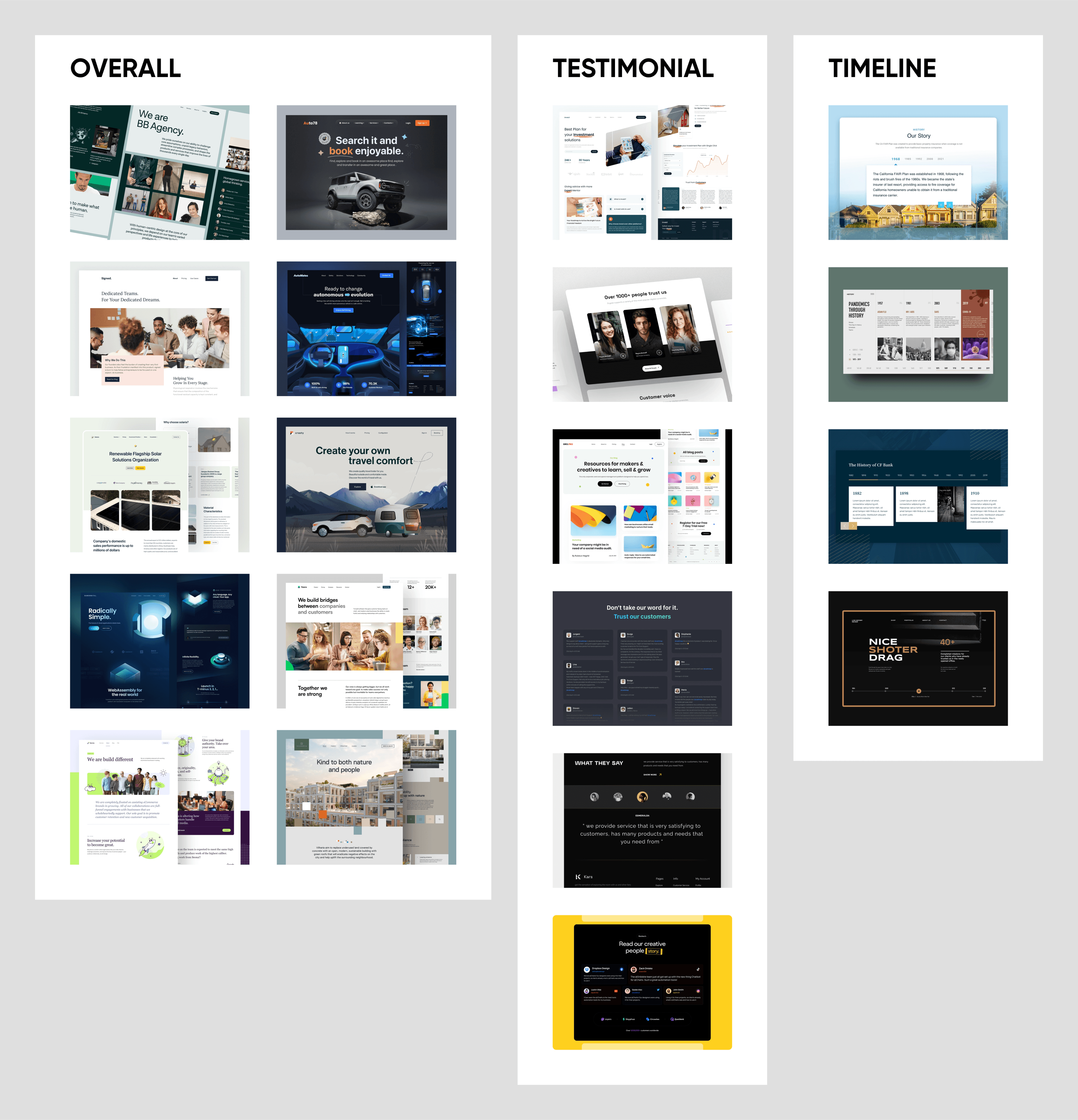
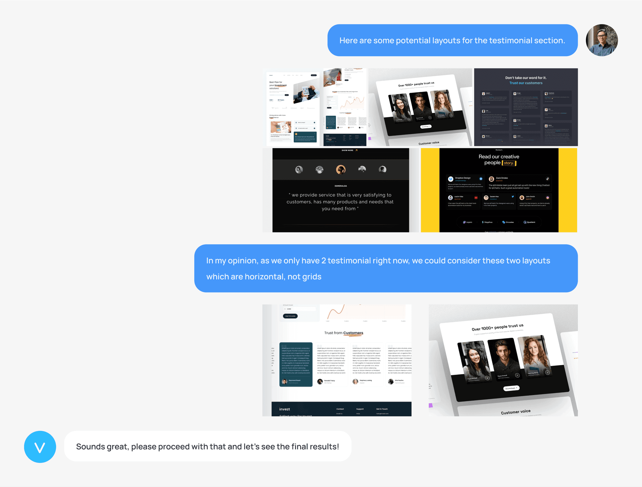
Things often went like this when I presented the board to the product team. I usually analyzed a little bit on my preferences, pros & cons and gave them the power to decide (ABOUT US module):
3. Deliver designs

3. Deliver designs

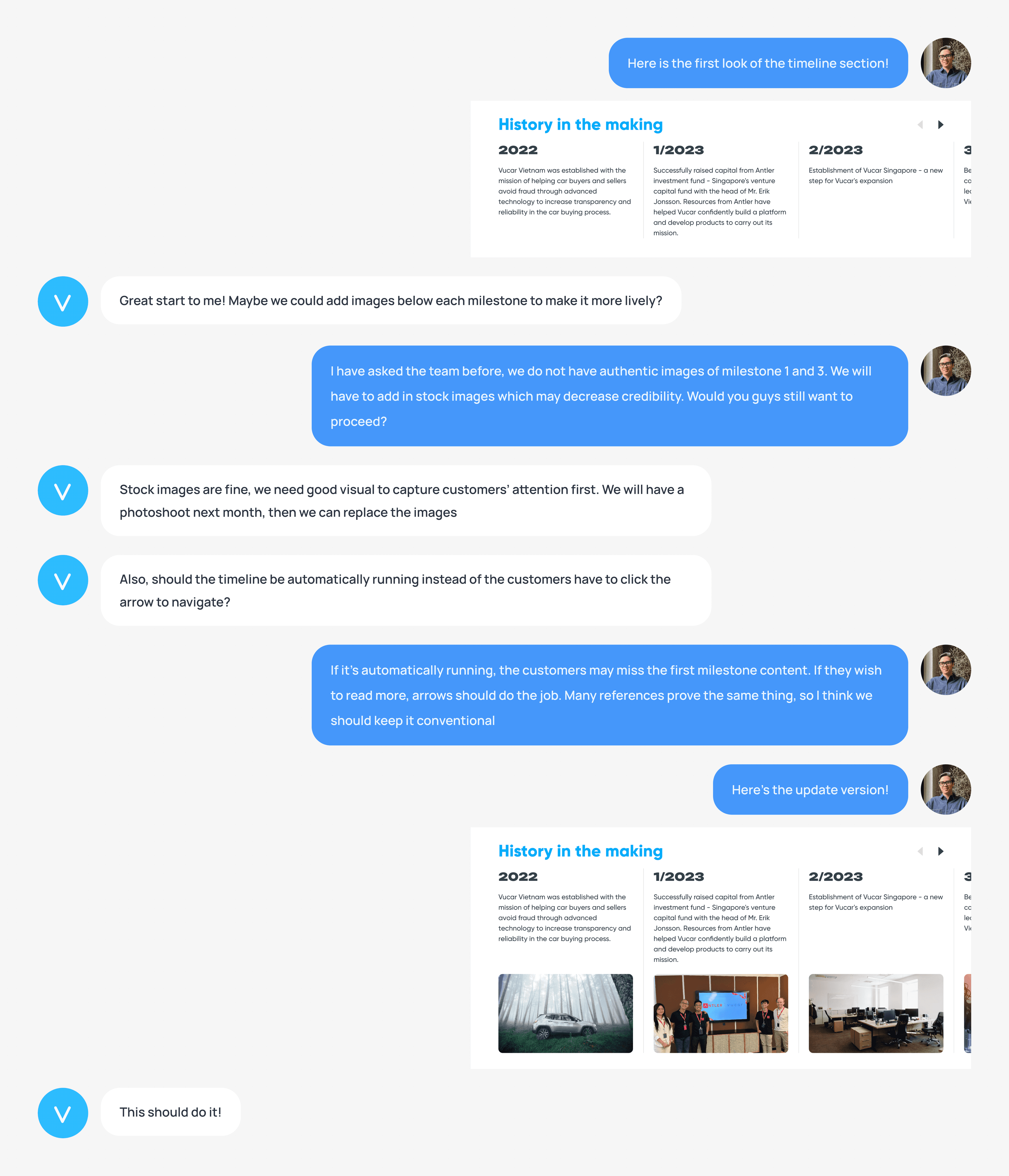
After knowing which direction I should head towards, I started delivering designs accordingly. As we had agreed on the visual direction and flows, this step often went smooth. Iterations only happened when the clients had additional requirements, or other factors came in to effect. We often discussed iterations like this (ABOUT US module):
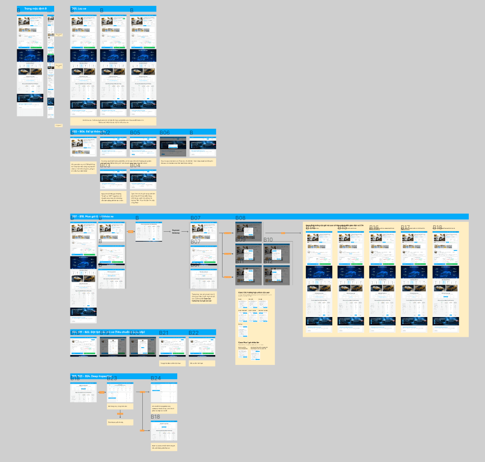
I usually delivered full cases (with complex module) so that the developers did not have to think of edge case, they could just implement staight-forwardly what was on the design file. I also wrote down notes that I thought developers may have concern about when implementing. I rarely had to describe stuff with the devs, my output did that for me already. This is an example of my output for the DETAILED CAR module (Just showing the concept. I know the screens, flows and notes are too small to see):
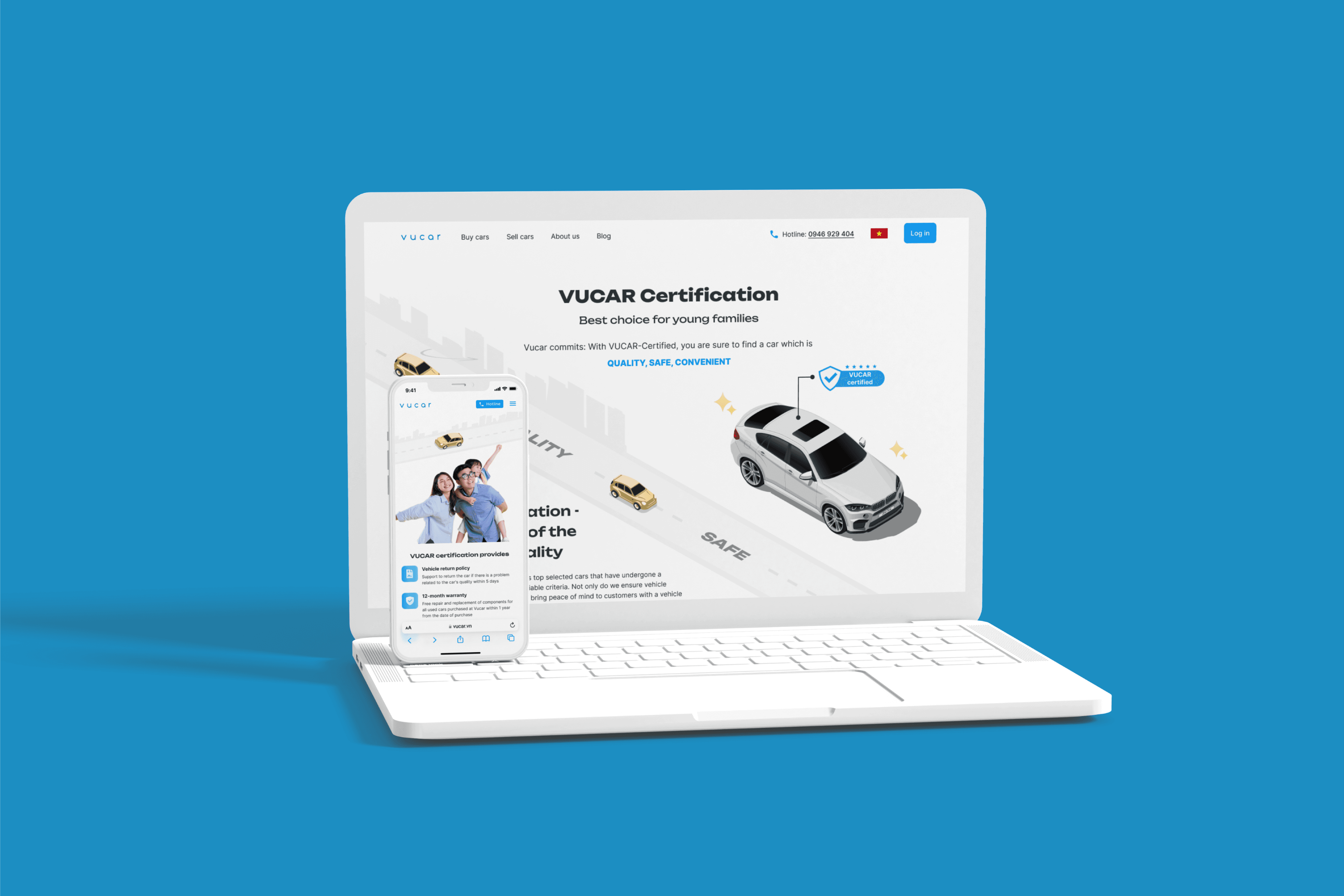
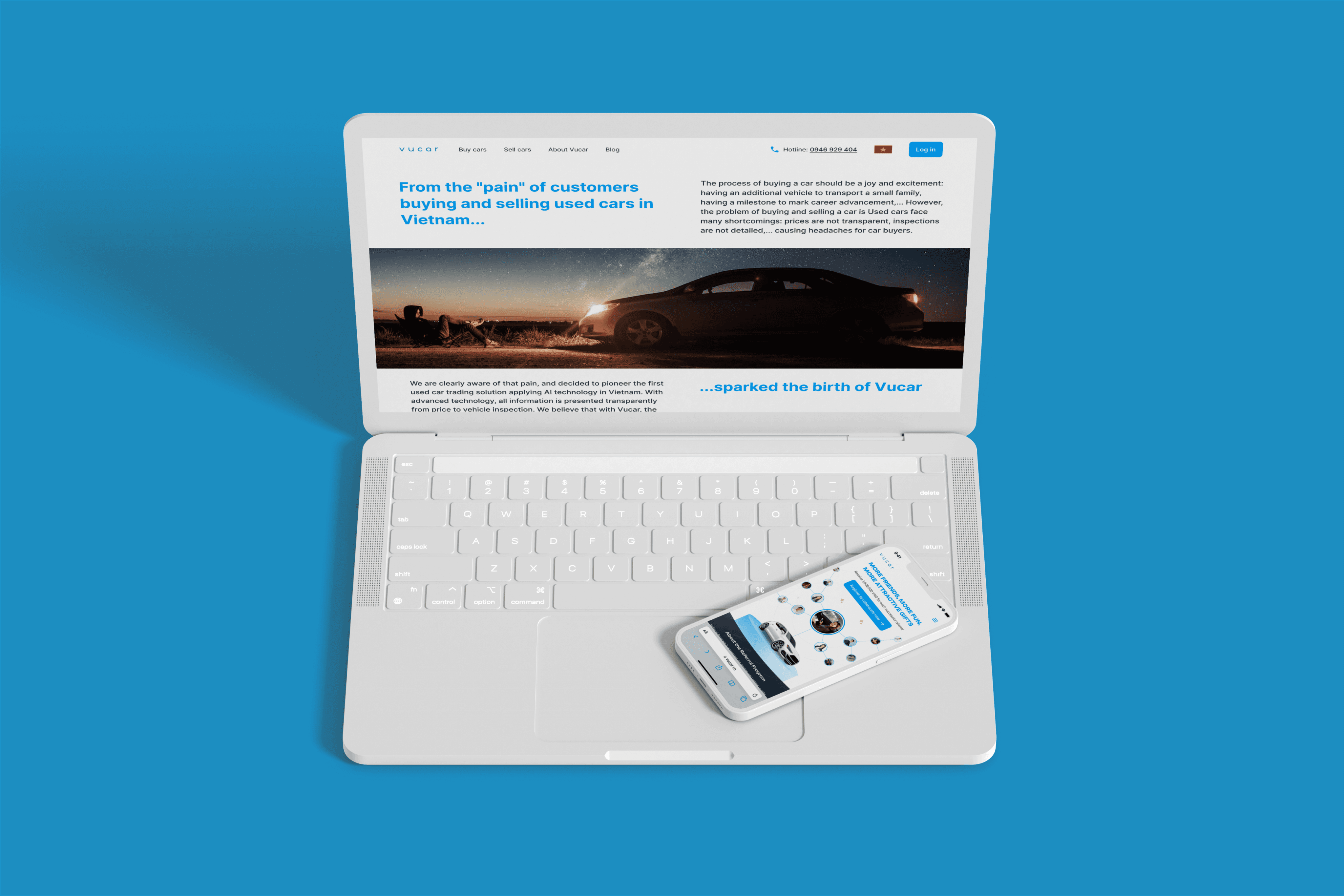
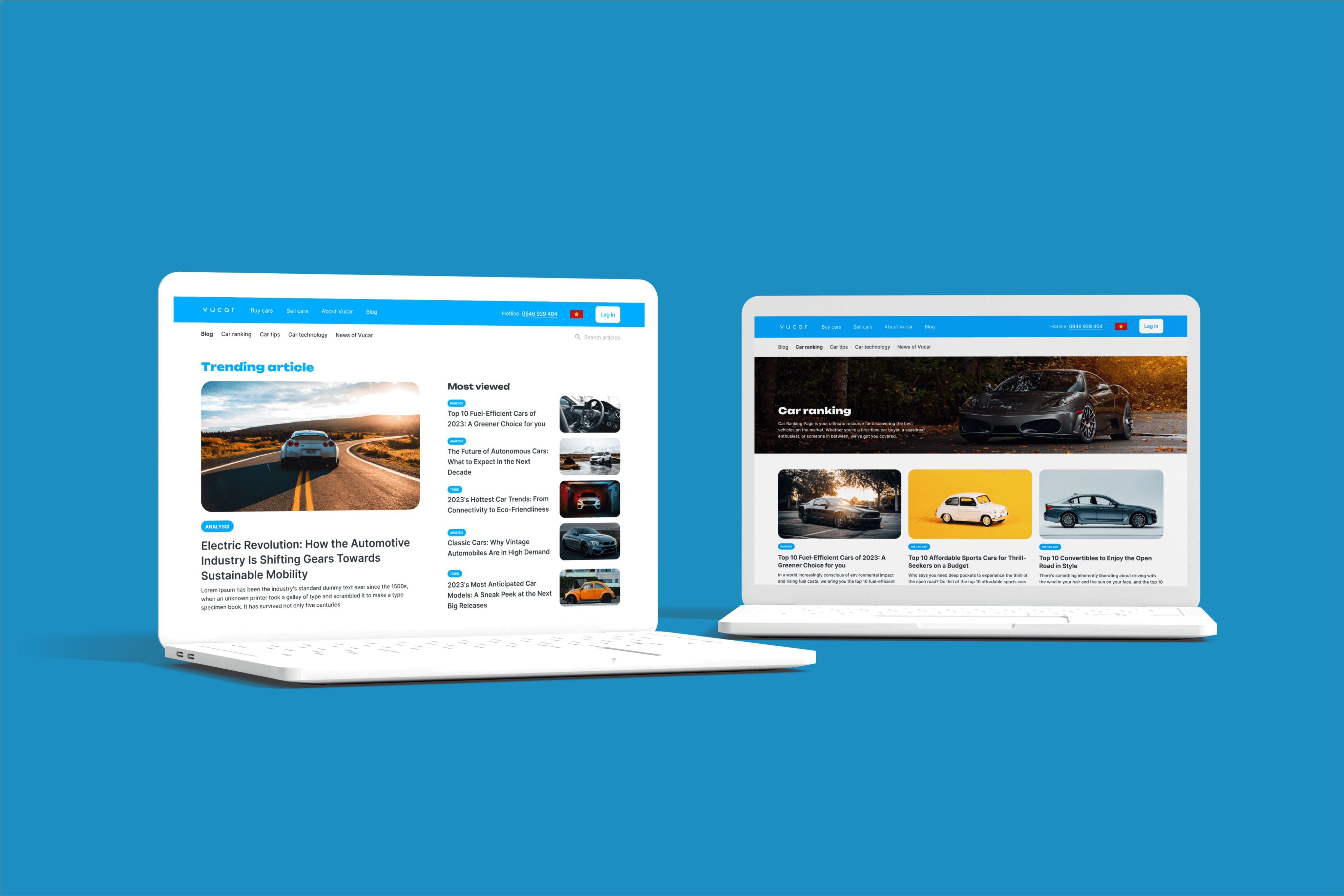
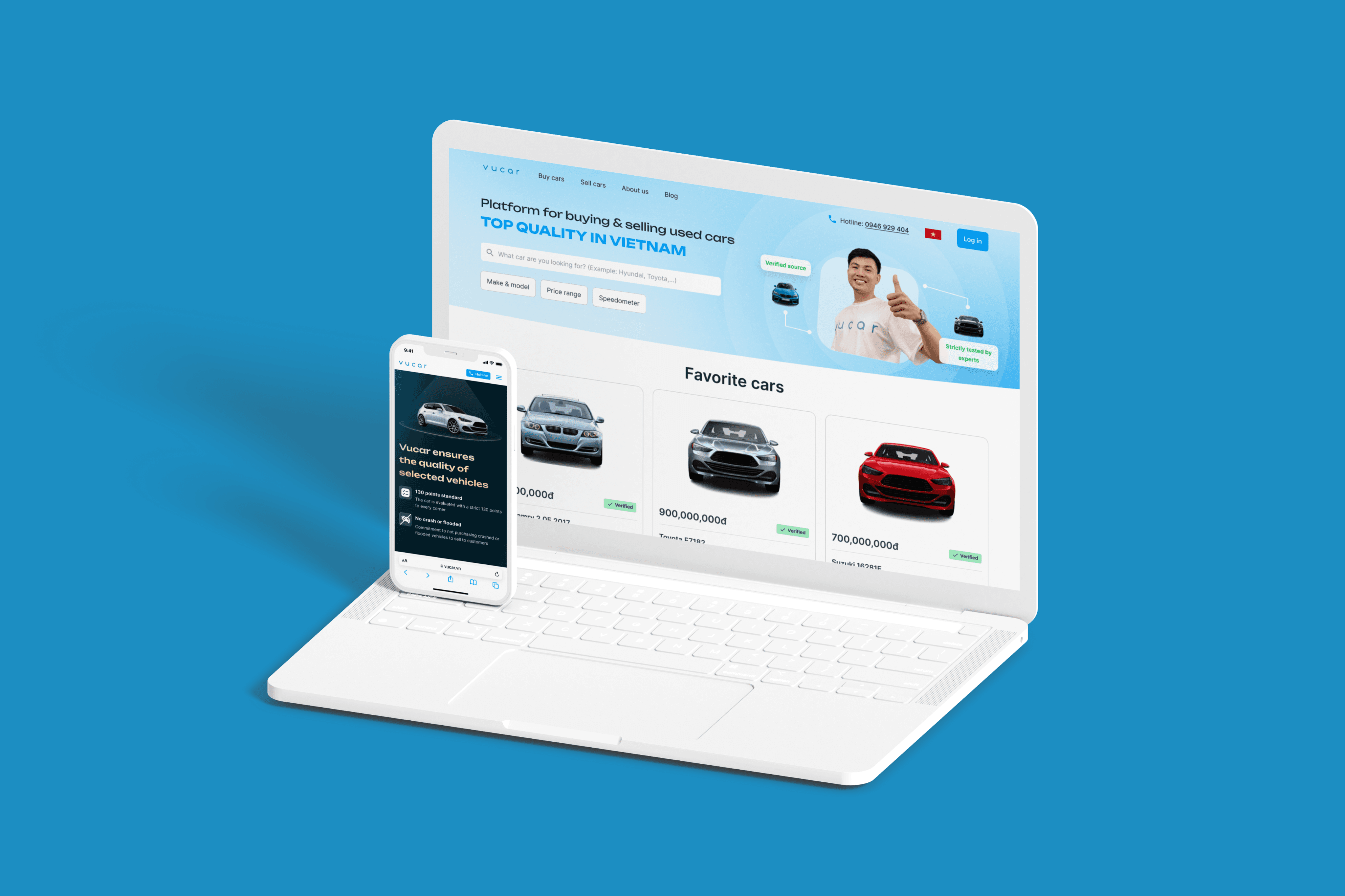
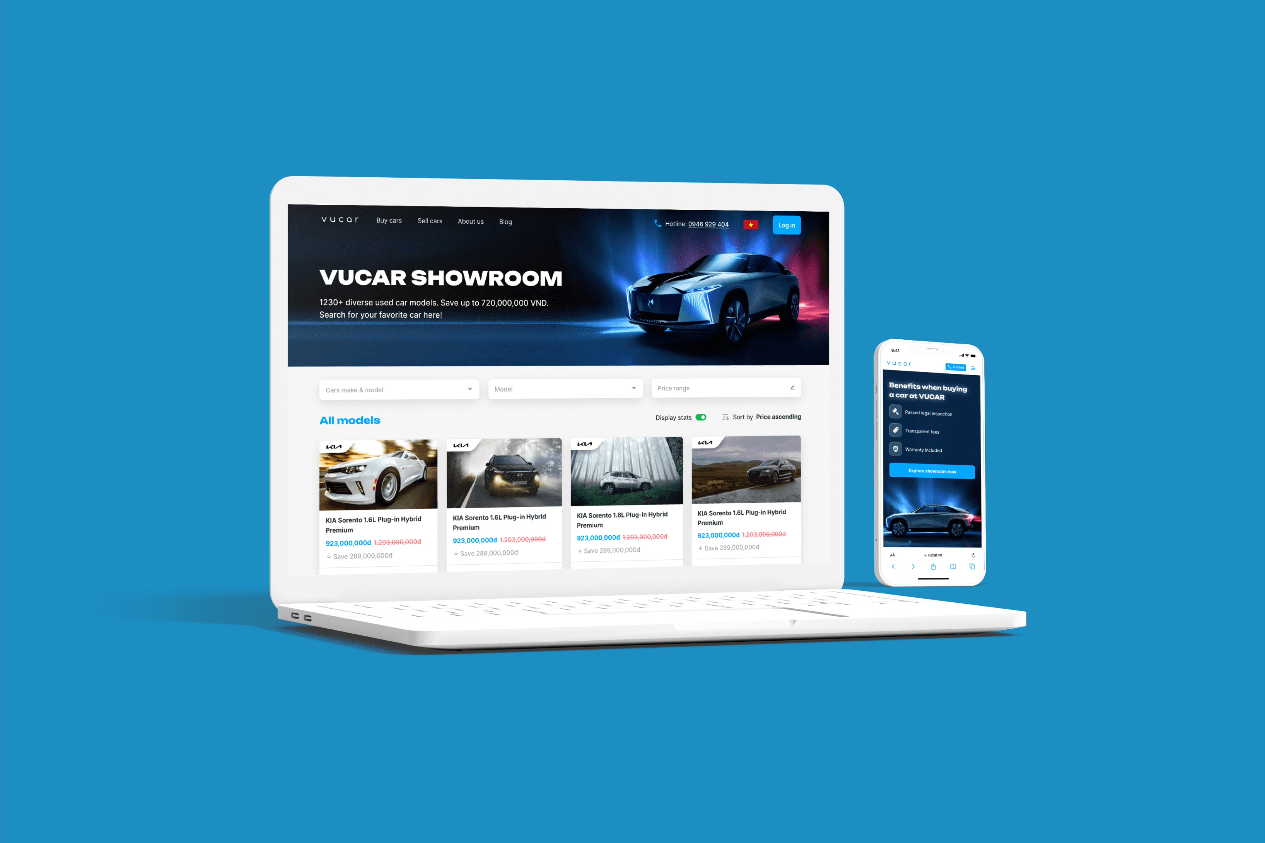
For a 5-month span, I had repeated the mentioned 3-step process for 14 modules for VUCAR, from very simple features to complex & visual focused screens. Let's take a look at my proudest output (visually), or you can see all modules delivered by me in this LINK!
Other projects

Other projects

TUGAN.AI

TUGAN.AI

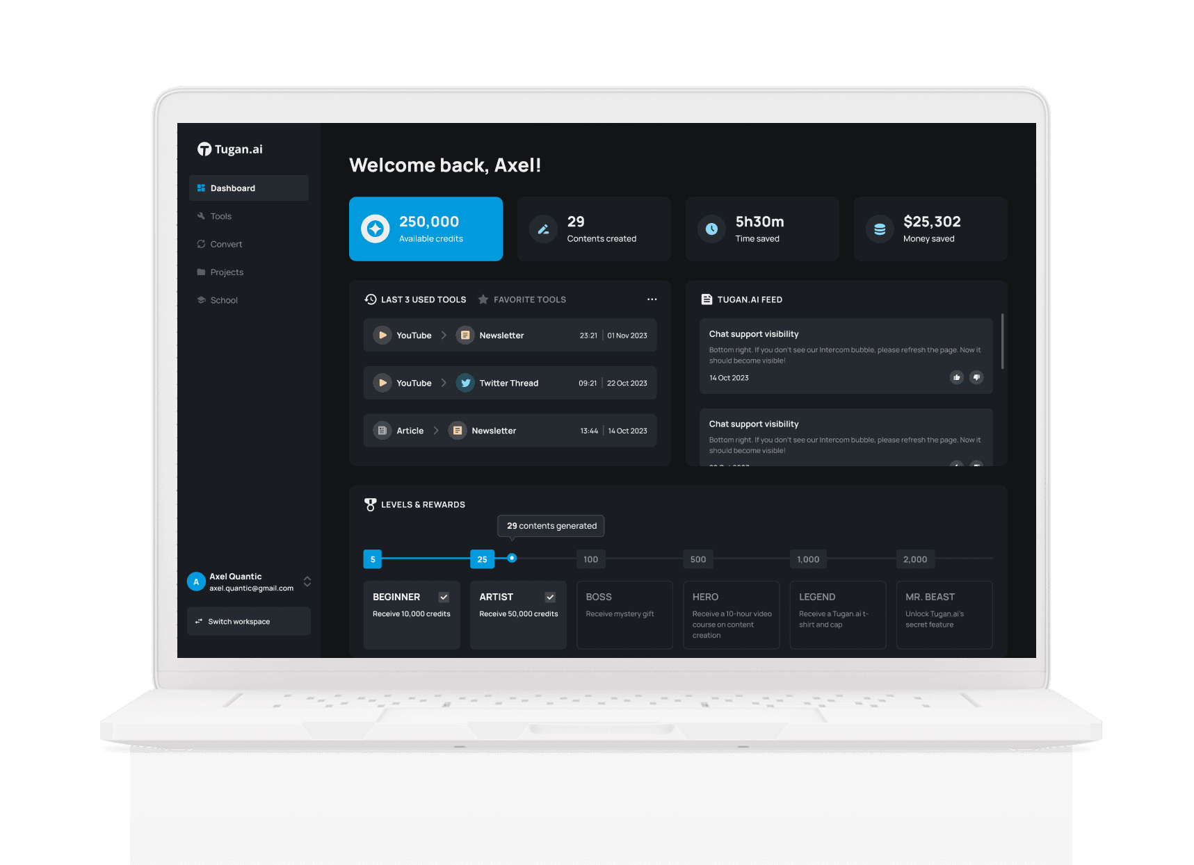
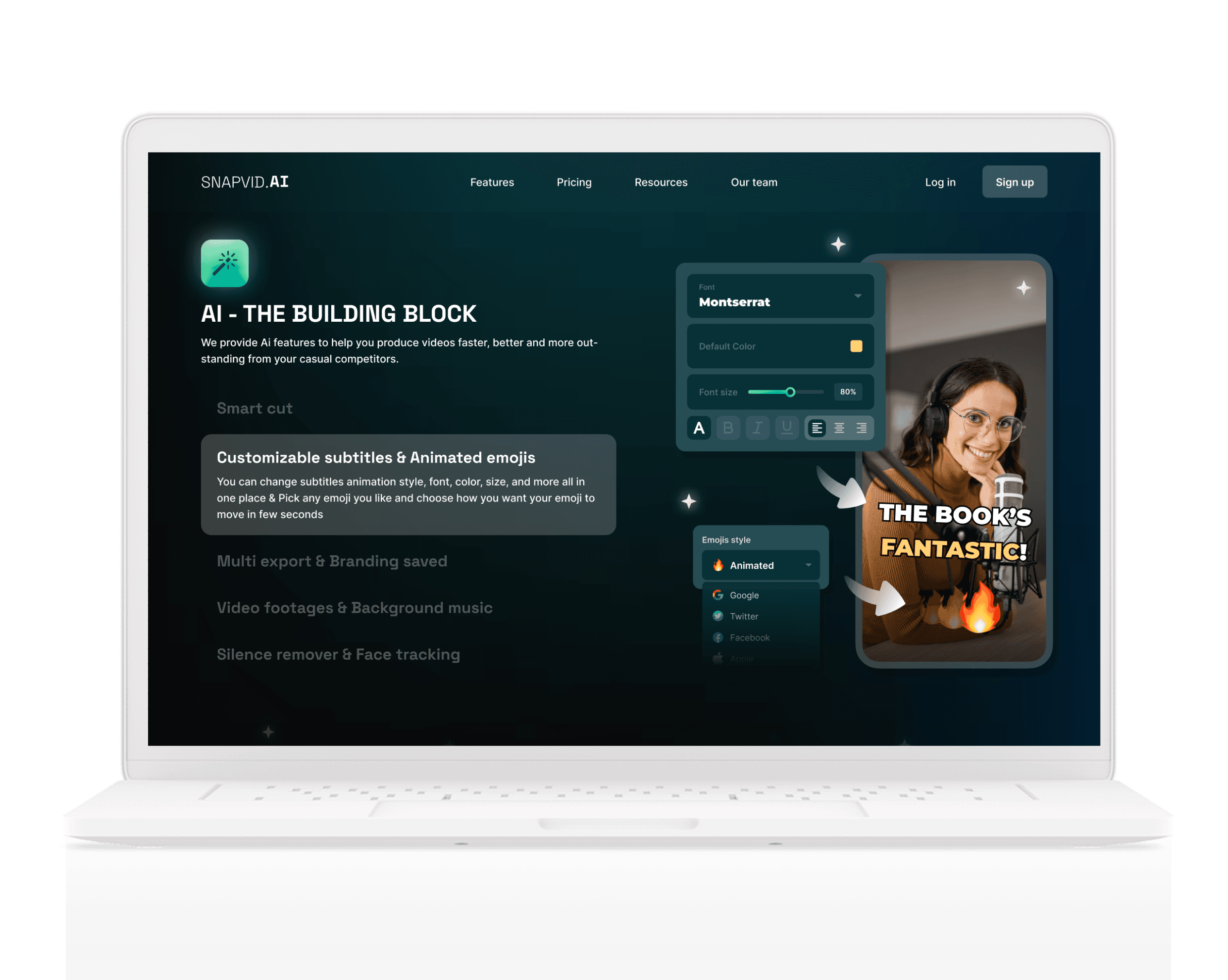
I designed web for an AI platform allowing users to input videos & articles and then convert to their preferred format

I designed web for an AI platform allowing users to input videos & articles and then convert to their preferred format

SNAPVID.AI

SNAPVID.AI

I designed web pages for an AI-powered platform allowing video editors to produce content efficiently.

I designed web pages for an AI-powered platform allowing video editors to produce content efficiently.

FTUSEATs

FTUSEATs

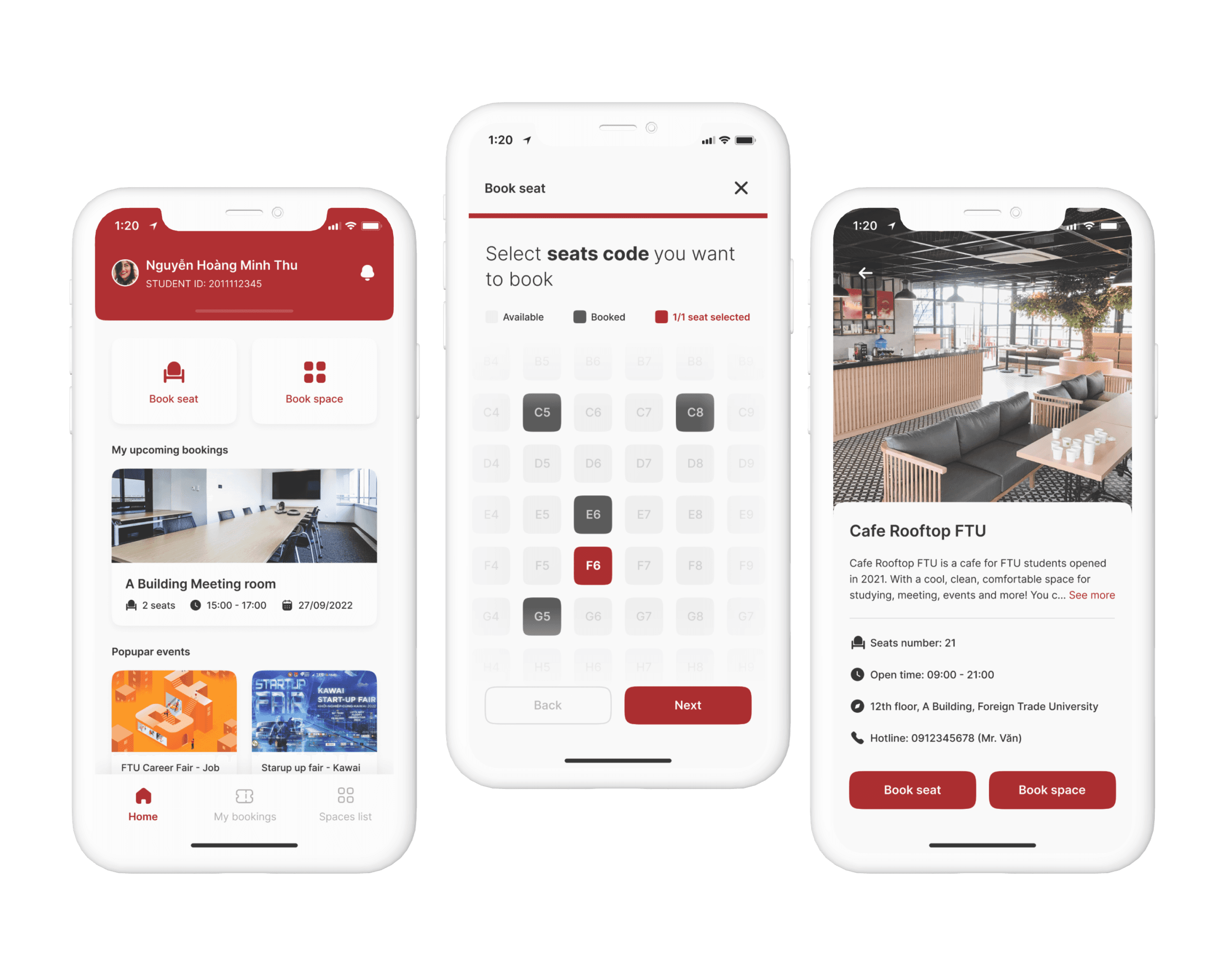
I designed a mobile app that helps students of Foreign Trade University book places for meetings and other activities.

I designed a mobile app that helps students of Foreign Trade University book places for meetings and other activities.

VIET HISTORY

VIET HISTORY

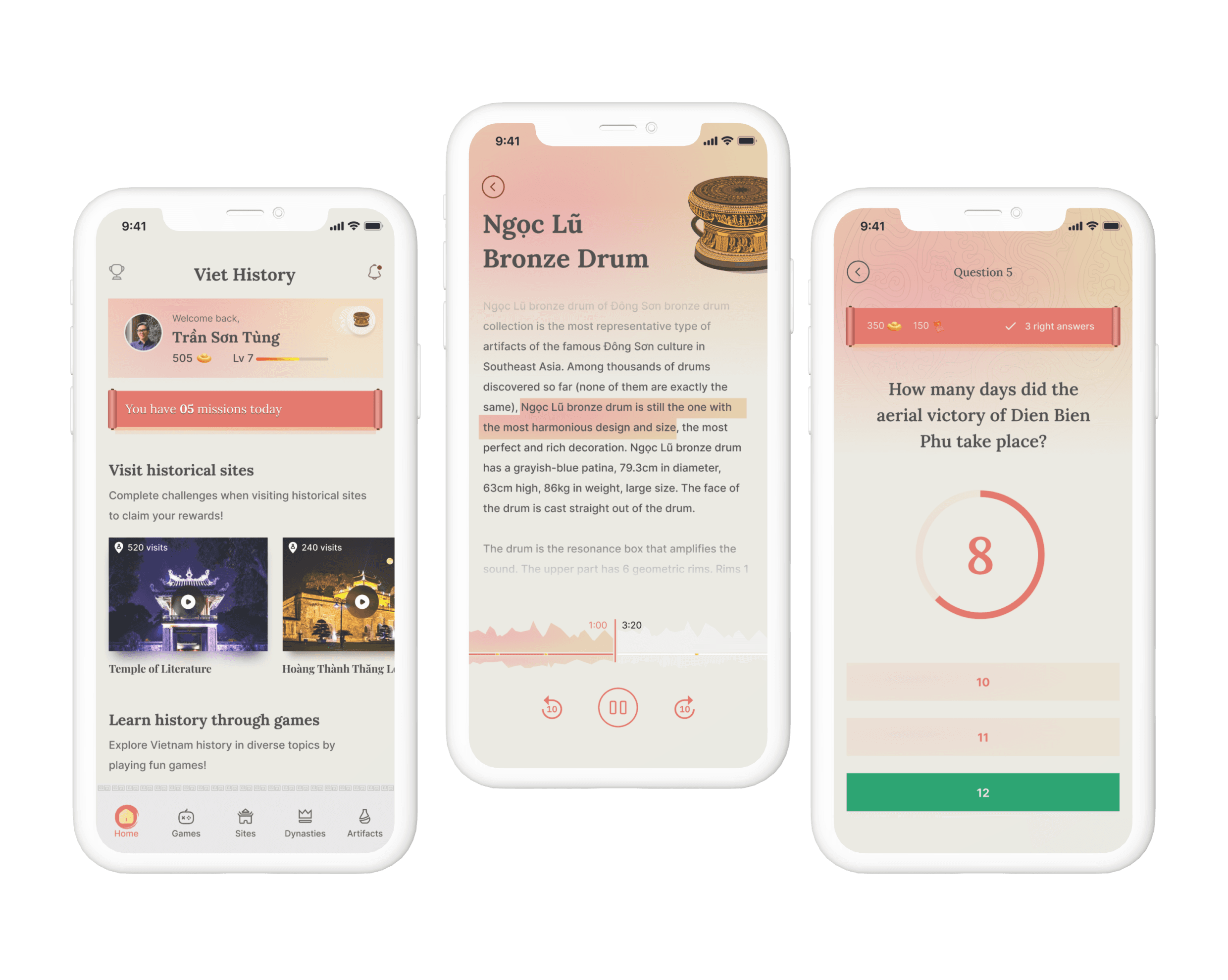
I designed a mobile app that helps Vietnamese enthusiasts learn & explore Vietnam history in a better way.

I designed a mobile app that helps Vietnamese enthusiasts learn & explore Vietnam history in a better way.

James

or send inquiry to transontung4010@gmail.com

or send inquiry to transontung4010@gmail.com